Psst. Anything I write on this blog is liable to have spoilers. I don't like doing spoiler warnings, but I casually spoil a huge part of this book, and haven't done that in anything else I've written here yet.
The story of Inio Asano's Solanin hits very close to home and I’m not sure how to talk about it without spiraling into a lot of really personal stuff. The thing is, even though I’m really excited about how Asano dealt with something so personal and relevant to me and many others in a similar situation, the most impressive things about Solanin are his storytelling choices. The fact that he tells a story that is this depressing and makes it feel somewhere between neutral and uplifting is a feat. He achieves this through investing in visual themes, giving character's thoughts their own narrative space, and through being very good at building jokes visually.
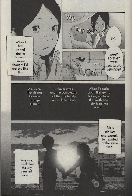
Above, we see the two young lovers silhouetted by the setting sun as Meiko makes a remark about how vast the sky seemed when her and the boyfriend, Taneda, moved to Tokyo to begin their lives after graduating from school. We are told the bit about the sky seeming big to her back then in a caption over the aforementioned panel, but of particular note here is the fact that Asano rarely captions panels. Most captions throughout Solanin occur in the black boxes. Only very rarely will Asano mix captions and images together directly, and only maybe once or twice are the words in those captions not a direct reflection of the images over which they are placed. Meiko or other character’s more abstract meditations about life or their friends, however, are never bandied about with other images. Asano is not frivolous with his words, particularly not in relation to his images.
Through packing the reflections of characters into a dedicated space, the mental/emotional life of characters--particularly Meiko--is taken seriously as its own narrative element. As a further result, captions that do occur over images have a weightier impact on even the least discerning reader: when unspoken words occur unbound within an image, it’s usually regarding something quite serious. It’s really important for Asano to earn the weight that these words have on these occasions, and I think he succeeds.
Asano loves to use the angle of his shots to build the scene. For instance, it’s not enough for the reader to see Meiko looking up here: the heaviness of the sky is represented in the manner in which the top panel bears down upon Meiko. This easily could have been a profile shot from eye-level showing her looking up. Similarly, the two panels could have been combined, shot from under Meiko, getting both her and the sky. Instead, Asano gives us both, fully, and in relation to each other, each providing us a visual representation of the words "low," “narrow,” and “heavy.”
If there was any mystery, the sky the theme of choice for this first chapter of Solanin.
Imagine this chapter ending without the prior time spent dealing with Meiko’s perceptions of the sky in relation to her struggle with purpose in the big city. Asano earns this page.
Humor plays just as important of a role in Solanin. On paper, this story should be ten times more depressing than it feels: two unemployed people, one has a dream for the other who sort of has the same dream, fails at it, then dies. Yeesh. But see, the very fact that the literal reading of the story feels so austere and so besides the point--despite being factual--means that Asano did a great job. Jokes play a big part in keeping this story grounded.
Asano milks a lot of humor--both in the words and the visuals--from the fact that things are so shitty for young people right now that getting a call back from a job is a surreal experience. Kato is so shocked that he got a call that he insists they must have the wrong person. Then, after hanging up, he gets a little panel of celebration, subdued both for comedic effect and for the fact that, well, it probably still doesn’t feel that real to him because it’s just so unbelievable.
Another thing I like about this page is the way Asano builds the meaty elements of the transition one on top of the other: the largest part of the building sits right in the middle, followed vertically by Kato’s fingers playing bass. A lot of that kind of stuff is way more technical than the average reader will probably notice or care about, but Asano can be anal with the placement of objects on his pages. The vertical profile of his pages lines up or juxtaposes objects and people frequently throughout the book.
Asano's humor is textbook in its use of setups, punchlines, repetition, and callbacks, and he does it all visually. Occasionally the gags--especially with Kato and Rip--just lean on absurd behavior. But many other times, that absurdity is locked into the visual rhythm. Using the chopsticks and the potato to transition here is not only a really balanced, visually appealing move: it puts extra attention on the chopsticks, amplifying the gag on the page's bottom half.
Often stories as tragic as this one are saturated with optimism or pessimism. I did not find Solanin to be guilty of either. Any time the story suggests something negative--that relationships are too much of a pain, that being alone is best, that your dreams aren't worth chasing, that life just is what it is and then you die--some part of the world laughs it off, without ever tipping the scale so far in the other direction as to suggest that everything will always be okay forever.


No comments:
Post a Comment