In his review of the first issue of From Under Mountains, Nick Philpott called it a “gorgeous tone poem of a comic.” In three reviews since I haven’t really found a better term than “tone poem,” because I’m not sure there’s a better way to describe the overarching work that artist Sloane Leong is doing on the title. Leong’s approach to this book came out of the gate strong in the first issue and it has carried through in all four.
Leong's flowing linework is a constant, but what stands out to even the least discerning reader is the color work and willingness to play with page layouts. Still, it’s hard to talk about the colors in this title as if they’re on a spectrum with much else colorful on the stands.
Colors in many comics are just sort of... there. Lately I’ve heard Michael Deforge talk about this or allude to this in a few places: if you’re creating a comic, you really ought to be asking why you’re adding the color. Of course, the reason for many mainstream comics is the fact that typical superhero fare does better with its target audience when it’s colored: financial reasons are reasons nonetheless. But, as a reader, in order to get the most out of your comic reading experience, you really ought to hitch your wagon to this idea that colors in comics should be worth your time.
What Leong does with colors on this title is not only quality work in and of itself: it is instrumental to the narrative. Everything—panel layouts, lines, inks, colors, words, word placement—plays into the narrative structure of a comic. Colors, even when they augment the narrative, often do so in small, practical ways. But in From Under Mountains, colors are often carrying more narrative weight than the words themselves. Rather than the colors doing small background work while the words push the narrative forward, I would argue that words serve an accompanying role to the slow burn of Leong’s issue-long color gradients.
One of the reasons that the role of color is allowed to shine through in such a feature role is because of Leong’s equal willingness to let panel layouts do the talking. Many comics you read have panel layouts designed to do nothing terribly more than act as a container for (what the creators hope to be) an effective storytelling rhythm. Again, this isn’t necessarily a bad thing; in fact, when the creator has a mastery of rhythm, he can play his layouts pretty vanilla to great impact (see: Naoki Urasawa, Alan Moore).
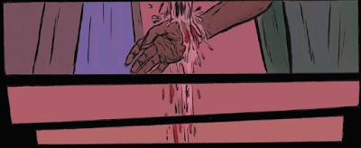
Each of Leong’s experimental choices work well on their own. What amplifies them greatly is that these choices often serve to represent the scene within the overarching color gradient for a particular issue. One thing that Leong does here and there is have characters step off the side of the scene and take their panels with them. The effect is a stair-like construction on the page, down to the right, which no doubt plays on the reader's perceptions of the page ending. What makes it really work, though, is that it reveals the color of the scene behind it, giving the overall tone of the page itself a prominent place front and center where the story was once occuring. You get a sense that in order to leave the page you’re reading, not only do you have to move on from that color gradient: the story does too, in a quite literal, visual sense.
Just what kinds of narrative roles do colors play? The most noticeable one is the representation of times of day via the ambient sunlight, or simply the color of the sky. Leong uses these colors to transition entire pages often, but also harnesses the sky as a theme within panels to do stepping transitions, just as is done with people. Here Leong shows how a comic artist doesn’t just need a script to create story beats: the beats are the at the whim of how the story is presented visually, and out of thin air Leong often creates small rhythms that add a deceptive amount of structure to the story. It is a mistake to think of a lot of these panels and color choices as mere ornamentation: stories happen across places and times, and rather than opting for straight captions, Leong moves the reader through the world as if they were within its boundaries.
I’ll leave you with one of my favorite pages from the story so far, one of the penultimate pages from issue four. Here, we see yet another example of color and panel layout working together to tell a story.
There is so much that goes unsaid in this image, so much foreshadowing, so much that is revealing about both of these individuals, and all because of the way Leong chooses to juxtapose one speaker as bigger than another. The differing sizes of the speakers on the page really only works because of the way Leong broke up the panels which, by the way, also serves to let the foundational color of the page itself bleed through—a color which is only pierced by the oppressive red setting sun in the distance.


No comments:
Post a Comment